Palmira
The client
Palmira is a boutique beach resort designed for travelers seeking slowness, warmth, and understated luxury. Hidden between palm trees and the sea, Palmira offers a discreet haven for those who live at their own pace: influencers, aesthetes, creatives, and fashion insiders. The experience is sensory, editorial, and highly visual. It is crafted for a community that values rarity and taste over ostentation
Services
Branding, Art Direction, Visual Identity


• The objective was to design a complete visual identity for Palmira that captures its luxury atmosphere. The brand needed to feel exclusive yet familiar, like a secret destination shared among friends.
• The direction blends editorial aesthetics evoking the feeling of a printed magazine left under the sun.
• From the logotype to photography and communication materials, the visual language translates Palmira’s philosophy of “soft luxury” into a cohesive experience across print, digital, and on-site applications.
Project Overview

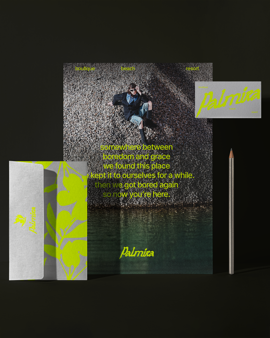
• Editorial visual identity:
Creation of a handwritten, lemon-yellow logotype paired with minimal sans-serif typography, reflecting both refinement and spontaneity.
• Art-driven content:
Poetic and discreet tone through short, evocative sentences and lowercase copywriting, favoring emotion over promotion.
• Editorial art direction:
Development of a photographic language inspired by vintage editorials, with natural light, grain textures, and cinematic framing that communicates intimacy and slowness.
• Brand touchpoints:
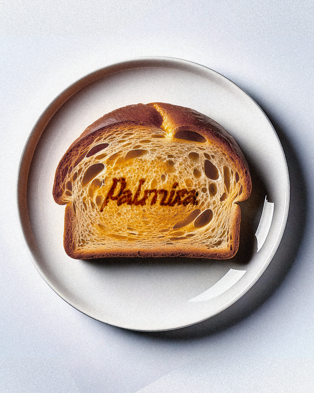
Design of print materials, collectible stationery, and seasonal editorial objects reinforcing the resort’s aura of exclusivity and insider appeal.
Key Contributions


• Palmira’s identity works around a luminous lemon yellow contrasted with greys and sea-inspired tones. This palette evokes sun reflections on water, warm sand, and soft fabrics.
• The choice of vibrant hues with summer energy, ensuring a strong recognition while maintaining an editorial sensibility.
• Applied across stationery, photography, and digital content, it creates a coherent, sensory universe that feels both refreshing and timeless.
Color palette


• Primary Typeface: A modern sans-serif typeface chosen for its clarity and composure, supporting the brand’s refined editorial tone.
• Illustrations: Organic line drawings inspired by Mediterranean flora used to evoke calm and nature.
• Together, the typography and illustrations establish Palmira’s distinctive voice: a visual whisper that embodies slowness, beauty, and effortless elegance.
Typography & Illustration


Cleeen
MORE PROJECTS

Rélévo

Mingle

Gogiya
